If you spend on Facebook and TikTok ads and send customers to your store's home page, you are probably losing a large share of your orders. The customer came from an ad for one product, lands on a list of products, a cart and lots of steps, gets distracted and closes the page. The fix is a landing page: a page for one product with everything the customer needs to decide and order, and nothing to distract them.
In this guide we go step by step: how to build a landing page that sells, which sections it needs and in what order, and how to measure its results.
Why does a landing page sell more than a store page?
- One goal: the whole page says one thing: order this product. No menu, no other products.
- Ordering on the same page: a short form with name, phone and address, instead of a cart, a login and payment steps.
- A message that matches the ad: the headline, photos and offer are the same ones the customer saw in the ad, so they feel they arrived at the right place.
- Built for mobile: most visitors from Facebook and TikTok ads open it on their phone, and a landing page is designed for mobile first.
The sections a landing page needs (in this order)
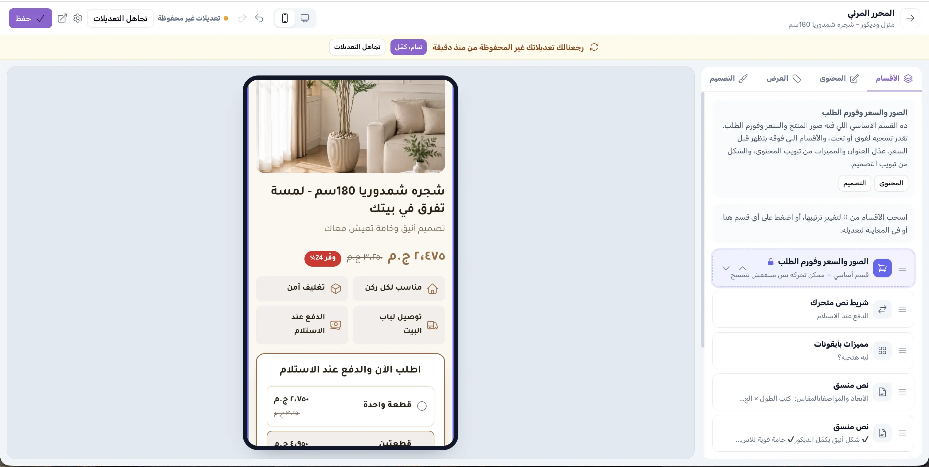
1. Headline, photos and price above the fold
The first thing the customer sees must answer 3 questions: what is it? What does it look like? How much is it?
- A clear headline with the product name and its main benefit, for example: "Compressed plastic boot: lasts you for years".
- Real photos of the product from more than one angle, ideally one of it in use at home.
- The price, clearly, and if there is a discount, show the old price crossed out next to it.
2. Quick benefits with icons
Right under the price, add 3 or 4 short points that reassure the customer, such as: shipping to every governorate, cash on delivery, we call you to confirm your order. These points remove the biggest worries of online shoppers in Egypt.
3. Quantity offers
Offers like "one piece for 475 EGP, two for 856, three at the best price" raise the average order value. Make the offer you most want to sell the default choice, and label it "most popular".
4. The order form
Keep it short: name, phone, governorate, address. Every extra field means fewer orders. And it is very important that the customer sees the shipping fee and the total before confirming, so they aren't surprised and don't refuse the order at the door.
5. The details that convince
After the form, write for those who need more convincing:
- Detailed benefits in cards with icons.
- A video of the product in real life, even if it is shot on a phone.
- A size or specifications table if the product needs one.
- Real customer reviews only. Fake reviews hurt customer trust and can hurt your ad account too.
6. FAQs and a final order button
Answer the questions that keep coming up in messages: how long does delivery take? Can I inspect it before paying? What if the size doesn't fit? And at the end of the page, put a big "Order now" button that takes the customer back to the form.
Tips that make a difference
- A real countdown: if the offer really is limited in time, a countdown encourages the customer to order now. Don't use a fake timer that restarts every time; customers notice.
- A sticky order button on mobile: an "Order now" button fixed to the bottom of the screen keeps the order one tap away while the customer reads.
- One page per different ad: if you have one ad for gifts and one for everyday use of the same product, make two pages with different headlines and compare them.
- Cut fake orders: a clear price and shipping fee before confirmation, a call to confirm the order and a deposit on high-value orders all reduce refusals at the door. Read 9 practical ways to reduce fake orders.
How do you measure a landing page's success?
- Install the pixel: without the Meta Pixel and TikTok Pixel you won't know which ad brought orders. The detailed steps are in the guide to installing the Meta Pixel and TikTok Pixel.
- Track the conversion rate: orders ÷ visits. If visits are high and orders are low, the problem is usually the page (headline, price or trust), not the ad.
- Calculate the real profit: after product cost, shipping, ads and refused orders. Use the online store profit calculator.
How do you build a landing page on HalaOrders?
In HalaOrders landing pages all the sections above are ready:
- From your store dashboard open Landing pages and press Add landing page.
- Choose a ready template for your product type (fashion, home, beauty, electronics, gifts or quick sale), and preview it with a product from your store before choosing.
- Choose the product, and the page fills in its name, photos, price and quantity offers.
- Edit in the visual editor: drag sections to reorder them, type directly on the page, change the colors, font and layout, and see the result on desktop and mobile.
- Set the offers and the countdown from the Offer tab, and save.
- Copy the page link into your ad, and follow the visits, orders and conversion rate of each page from the dashboard.
Orders reach your dashboard like any other store order, with cash on delivery.
The bottom line
A successful landing page is simple: a clear headline, real photos, an understandable price and offer, a short form that shows shipping and the total, and details and FAQs that reassure the customer. Start with a ready template, test two headlines or two offers, and let the conversion numbers tell you what to keep.